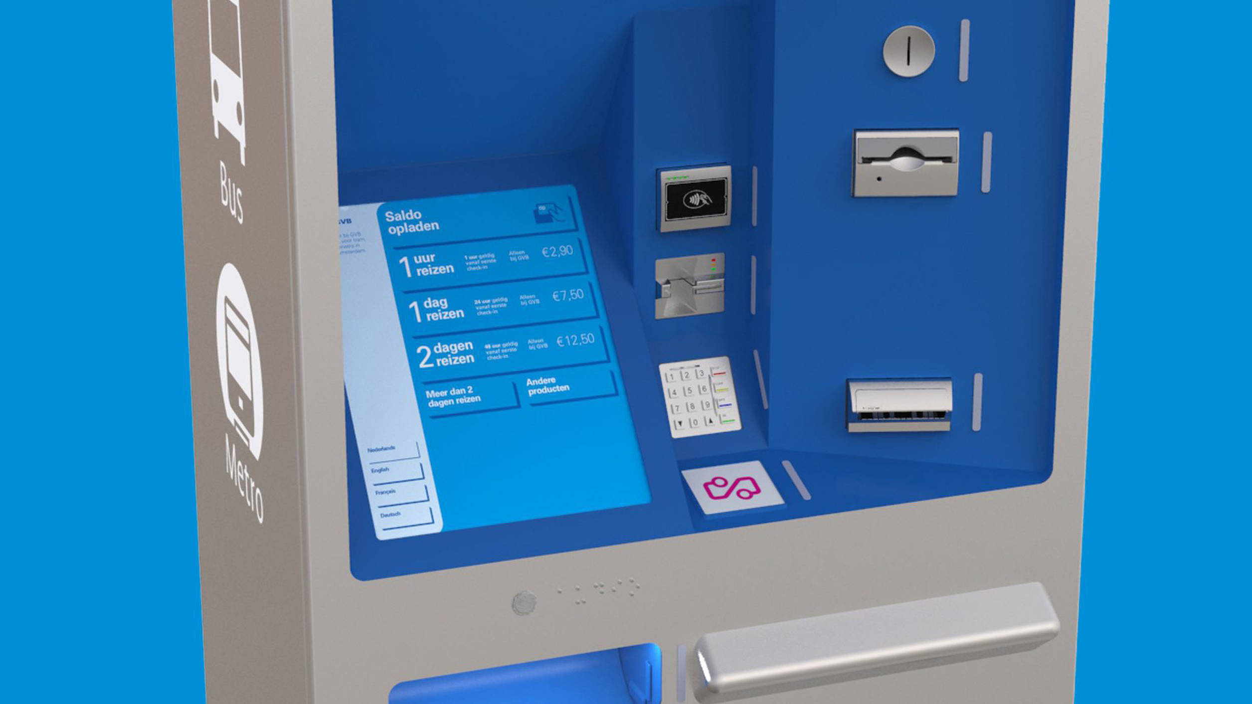
GVB, a prominent public transportation company in Amsterdam, embarked on a project to enhance their ticket vending machines. In collaboration with Fabrique, GVB aimed to revolutionize the user experience by adopting a more user-centric approach. This initiative was a significant departure for the company, as it was the first time they enlisted a design agency for such a project. The challenge was to create an interface that seamlessly integrated digital elements with physical components, ultimately optimizing ticket purchasing and circulation efficiency.
Continuous feature cycle
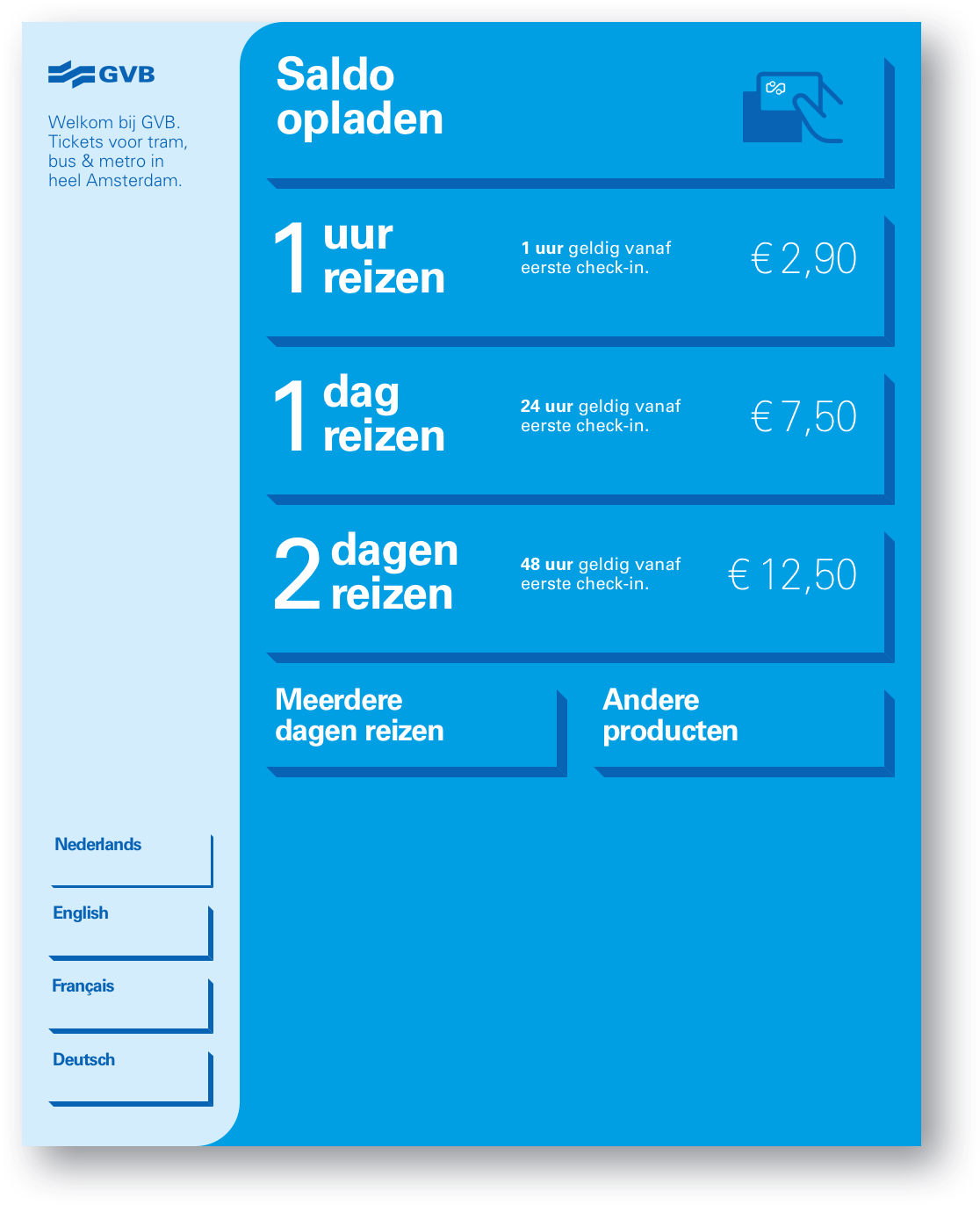
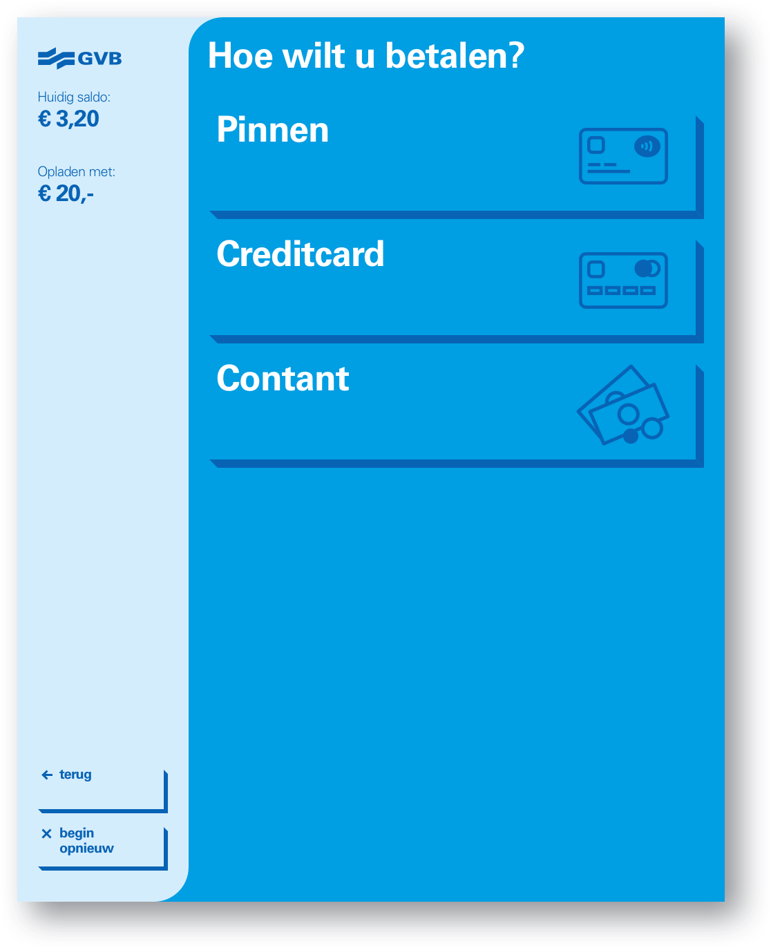
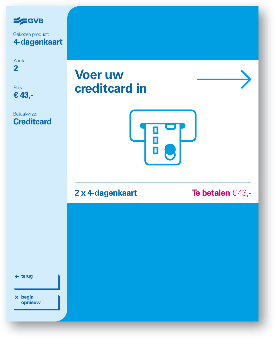
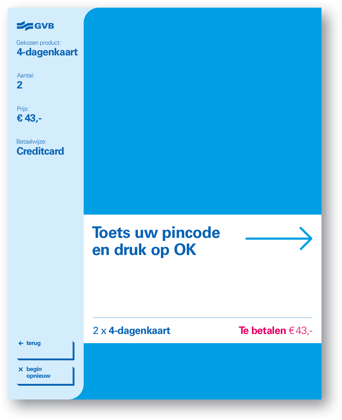
As a UX designer part of a larger team, I focused on translating key concept principles into modular UX patterns, utilizing prototypes to conduct rapid user testing and iterate on design solutions. Especially the mechanics used to lead a user in and out of the digital interface, required many iteration cycles with which testing was vital.
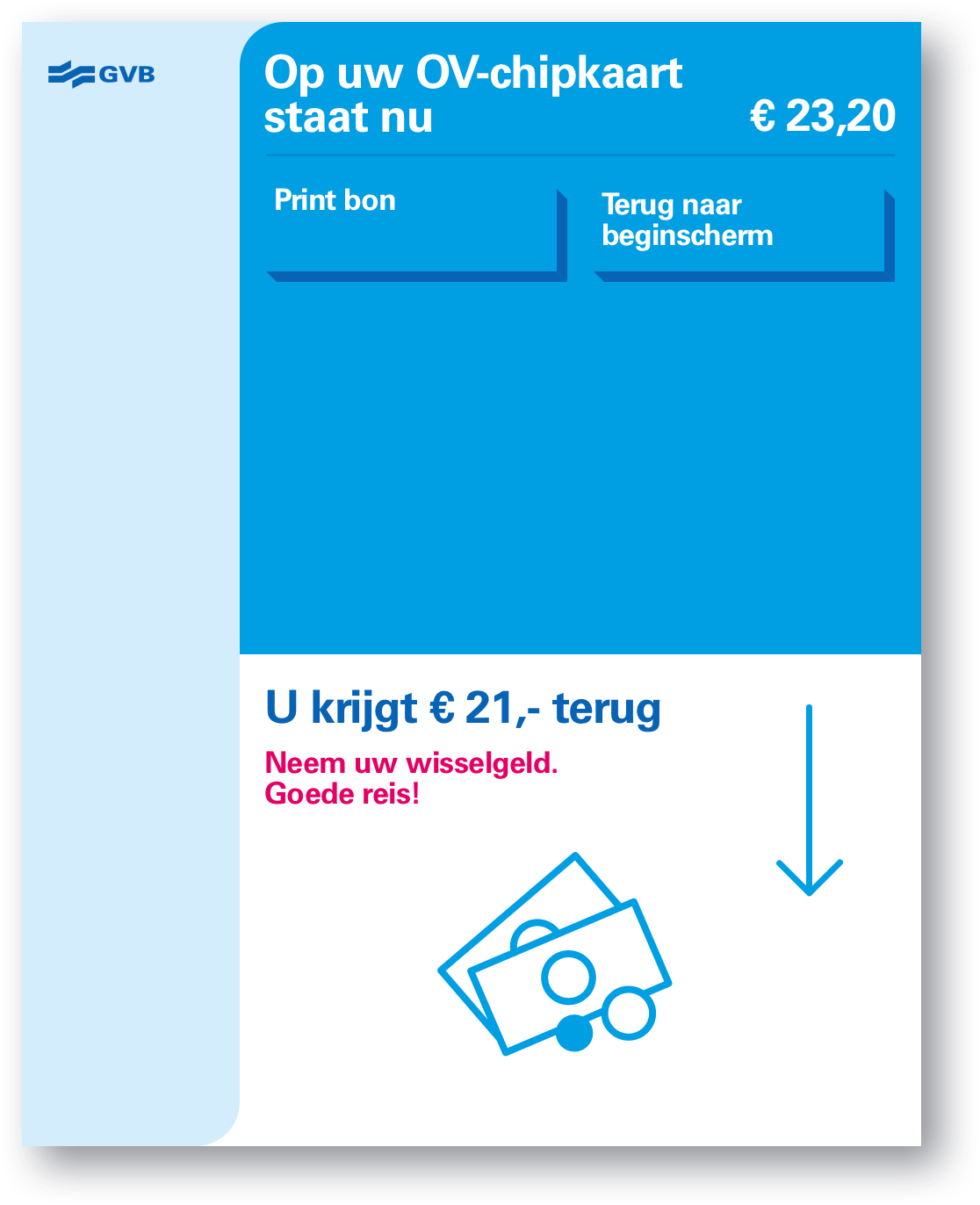
Prototyped screens
A flow fit for all kinds of users
By prioritizing the needs and preferences of GVB's diverse customer base, we aimed to design a ticket vending machine interface that was intuitive, efficient, and engaging. Through user research and iterative design processes, we ensured that the end product aligned with the users' expectations, reducing friction and enhancing the overall user experience. The challenge lay in designing an interface that seamlessly merged digital elements with physical components. I collaborated closely with the other designers to create a cohesive and harmonious design that simplified the ticket purchasing process while ensuring ease of use for all users, regardless of their technological proficiency.
Rapid validation cycles
To streamline development and future scalability, I established modular UX patterns that could be reused throughout the ticket vending machine interface. This approach not only facilitated consistency but also expedited the design process, allowing for quicker iterations and implementation of user feedback. To validate design decisions and gather user feedback early in the process, I developed interactive prototypes that accurately represented the ticket vending machine's functionality. Through user testing sessions, we gathered valuable insights, enabling us to refine and optimize the interface based on real user interactions and preferences.
