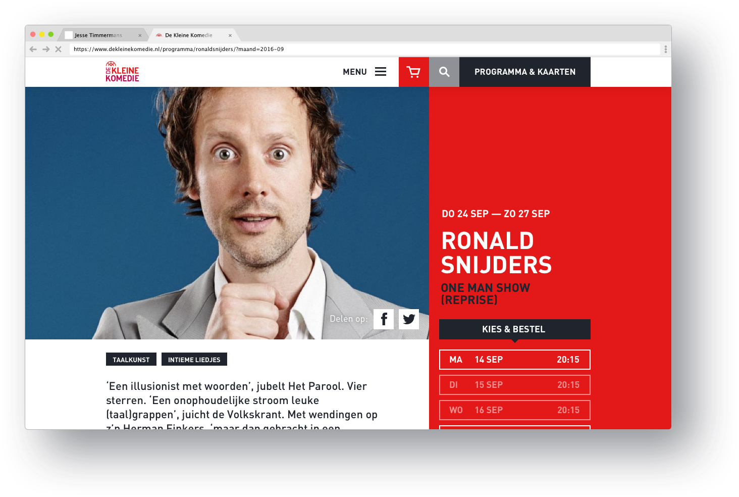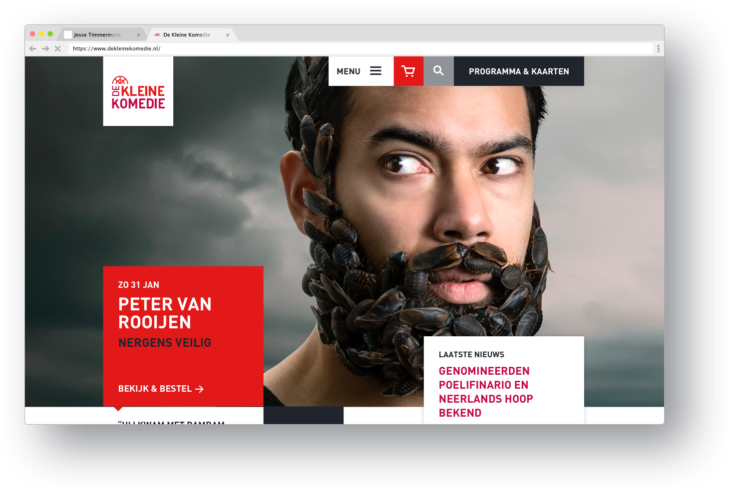
De Kleine Komedie's homepage placing the comedian centre stage.
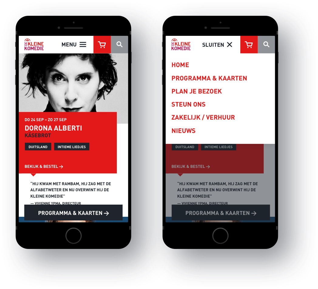
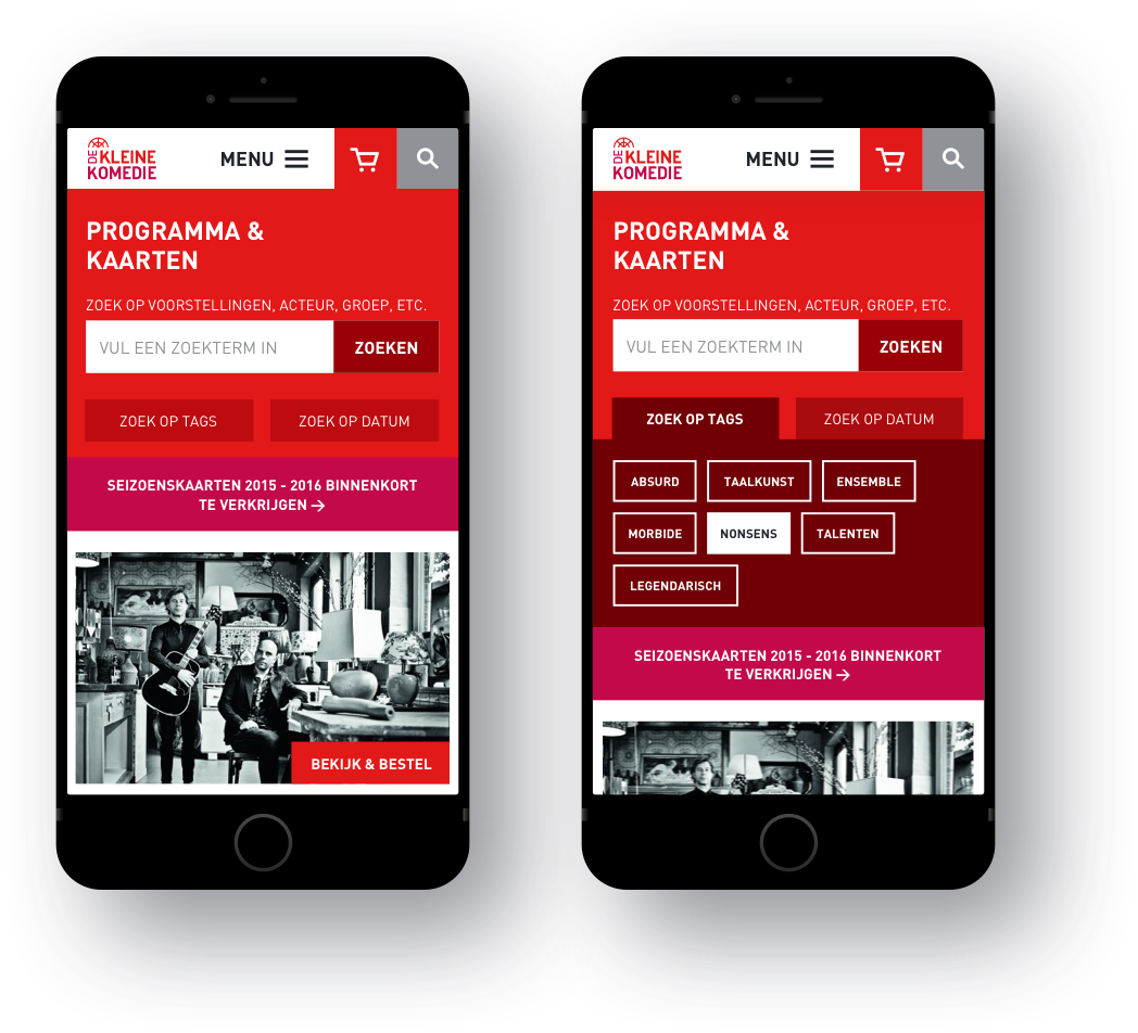
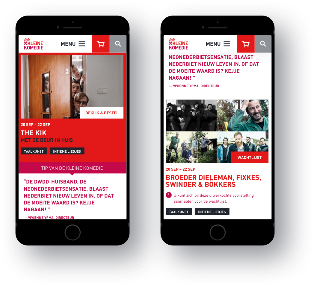
As part of the design team, I had the opportunity to work on the redesign of De Kleine Komedie, Amsterdam's iconic comedy theatre. The new design aimed to capture the bold character of the theatre while prioritizing killer conversion. The visual impact was essential, but it was in enabling the creative use of content where the website truly shone. I designed UX patterns such as quotes from the director, implemented uncommon tagging, and injected humor throughout. Our design process focused on optimizing user journeys and incorporating persuasive design patterns to enhance conversion. This included sticky call-to-action elements conveniently placed near the user's thumb, clear site navigation, and a well-defined page hierarchy.
Bold Character
De Kleine Komedie is known for its unique character, and our design sought to reflect that. The website's visual elements were carefully crafted to capture the essence of the theatre, making a striking impression on visitors. My responsibility as UX designer was to make sure the bold colors, captivating imagery, and engaging typography that create that resonated with the theatre's spirit, were used throughout the customer journey, not just a one off.
Conversion-focused design
Our design approach revolved around optimizing converstion through brand-led narratives and storytelling. We carefully analyzed and mapped out user journeys, identifying pain points and opportunities for improvement. Leveraging persuasive design patterns, we incorporated elements such as nudges to encourage users to take desired actions. A sticky call-to-action feature, placed within easy reach of the user's thumb, ensured a seamless and convenient conversion process. Clear site navigation and a well-structured page hierarchy improved user flow and accessibility. All with that unique Kleine Komedie wink.
